Boston Red Sox
Sports Marketing & Brand Design
Visual storytelling for one of baseball's most iconic franchises, from Fenway Park to fans' feeds
Overview:
The Boston Red Sox are one of the most storied franchises in Major League Baseball, with a passionate fanbase and a media presence that spans social media, digital platforms, broadcast, and in-stadium experiences at and around historic Fenway Park.
Challenge:
Working within the media market of Boston means operating at a high standard in a very public environment where the response from fans is immediate and unfiltered. The Creative Services team functions as a mini in-house agency, and the challenge was keeping up with the pace of a live sports season while producing quality content across a wide range of formats and platforms.
Solution:
As a Jr. Graphic Designer, I worked alongside the Social Media and Photography teams to produce content for gameday experiences, player hype graphics, social campaigns, email newsletters, print ads, and digital assets for redsox.com. I also contributed to more unique projects including an augmented reality map of Fenway Park for the MLB BallPark app and a Mother's Day animation. Being part of the in-house creative team during an exciting time for the franchise on the field made the work feel meaningful and gave me a firsthand look at how a professional sports organization builds and communicates its visual identity to fans.
Responsibilites:
Year:
Jr. Graphic Designer
2018-2019
@redsox social
Sharing a collection of social assets that were shared to fans online and engaging with our owned channels
Game day graphics
Goal: Create captivating game day graphics for immediate release on social media after the game. With templatized graphics, we needed to craft mesmerizing looping visuals that captured the essence of each game. Get it done before the seventh inning unless the game goes the distance.
Outcome: Red Sox fans flocked to our posts and voiced their opinions of how each game went. The aesthetic of each post elevated the fan’s experience post game. As you might think, Sox fans are very opinionated. Twitter was a great spot to see the interaction. These were especially fun because of the live photos that we were getting from the field.
Once the template was in place, it was still easily customizable for a quick copy change.PLAYER QUOTES
Goal: Create templated static designs to be apart of the post-game messaging that went out after each game.
Outcome: Fans really loved seeing these post-game quotes from different players and coaches throughout the season.
There is a simple a color palette and typography but it made for an effective and legible design.Fan EXCITEMENT post
Goal: In the dog days of December 2019, it was important to keep the passion of the WS Championship season into the next season. All hype, all the time!
Outcome: When its cold and there wasn’t any MLB games happening, the fans received some extra energy to bring them into the following season.
Selling Tickets
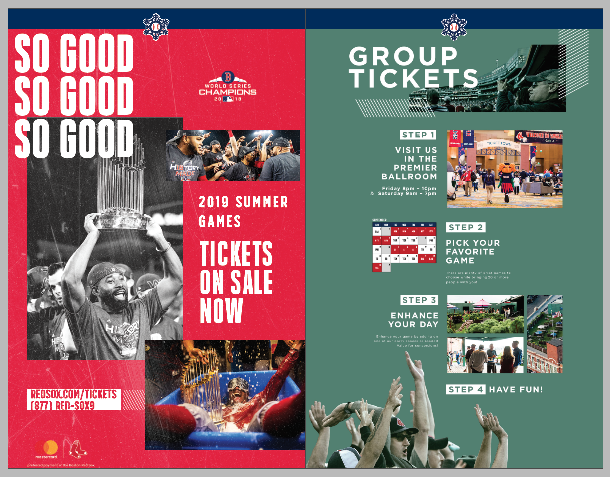
Goal: Drum up excitement and get fan’s butts in seats. Promoting for Monster seats and the new Sam Deck.
Outcome: Fans new and old definitely seemed to engage with these ads. We saw an uptick in ticket sales Y2Y.
Double Play Pax
Goal: Promote packs of games for fans to same some money on tickets to the game.
Outcome: With an updated championship aesthetic, fans came in droves to purchase these special tickets.
Player Highlights
Sharing a collection of digital illustrated creative assets that were shared to fans via email and the different monthly newsletters
downloads of the month
Goal: Create vibrant illustrations capturing the essence of the 2018 team.
Outcome: Gained knowledge about the illustration process and establishing a certain style. Fans resonated and downloaded these special moments for their phones.


“Vintage Nostalgic” Aesthetic Exercise
Goal: Develop a new look that captured the essence of our new brand aesthetic.
Outcome: This was experimental in it’s nature but was good to be able to collab and bounce different visual solutions off with the larger creative team.
Augmented Reality Map
Goal: This month-long project featured a printed map of Fenway that folks could use their phones to see different Augmented Reality experiences placed around the Park.
Outcome: A revamped design, made it a lot easier to read and digest all the locations of the plaques throughout the park. Lots of fans continue to use these today!